Ready to refresh your home? The 2025 home interior colors trends are here—and they’re warmer, richer, and bolder than ever.
Brands like Pantone and Sherwin-Williams are moving us away from cool neutrals. They are introducing warm colors that bring joy and show personality. Whether you’re planning a full makeover or just upgrading your home decor, these trending shades will help redefine your space with style and intention.
Below, discover the hottest “in” shades and the tired tones you can finally retire.
WHAT’S IN
- Mocha Mousse (Pantone 17-1230) headlines the palette with a velvety brown that wraps a room in café-like comfort. A great choice in today’s trending home interior colors, it looks beautiful with woven textures and natural stone in modern decor.
- Cinnamon Slate 2113-40 from Benjamin Moore is a purple shade with a cocoa undertone. It offers a nice mix of luxury and comfort, perfect for living rooms or statement ceilings.
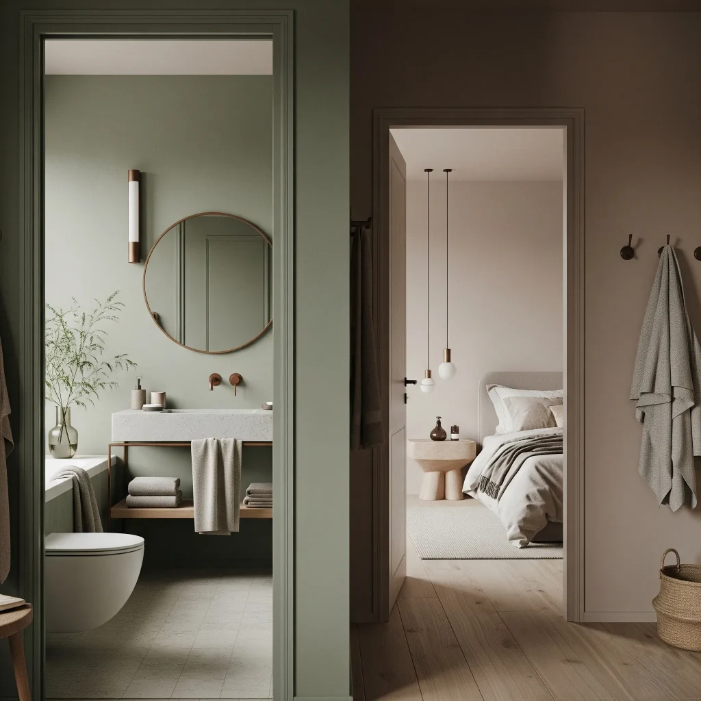
- Quietude HGSW6212 is a calm tone from HGTV Home by Sherwin-Williams. This soft blue-green is ideal for relaxing bathrooms and peaceful bedrooms, a standout in calming home decor palettes.
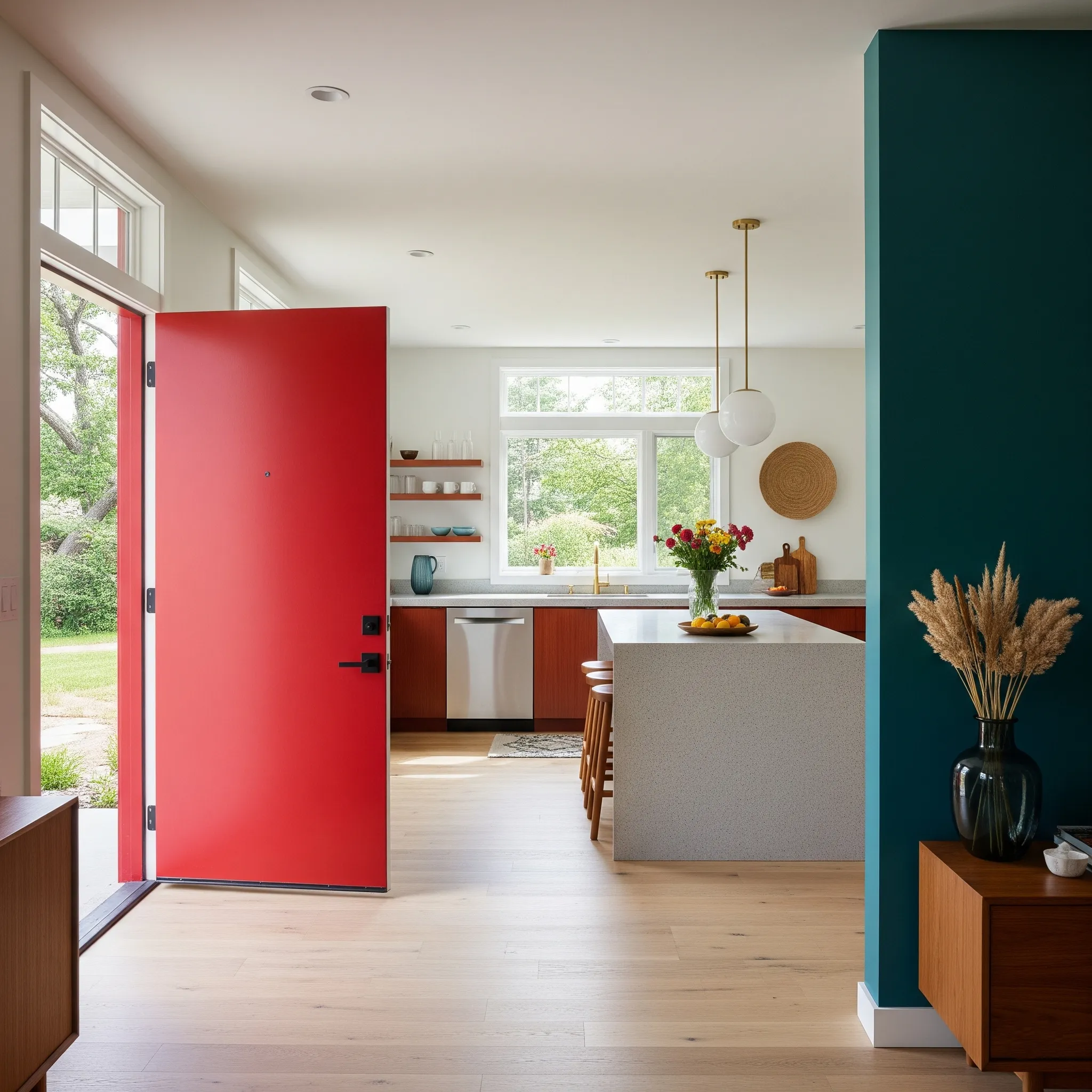
- Rumors MQ1-15, Behr’s bright ruby-red, adds energy to entry doors, kitchen islands, and accent walls without being too strong. A bold pick for dynamic home interior colors that set the mood.
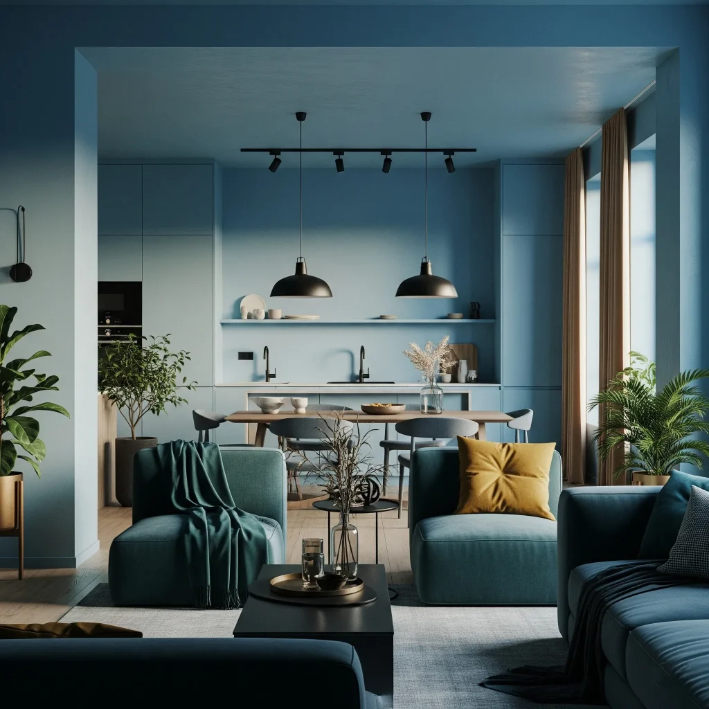
- Encore 8002-45G from Valspar is a deep blue that works well in open spaces and pairs beautifully with matte-black fixtures, adding a stylish touch to home decor.
Look for the best paint colors to use together in 2025. Imagine mocha walls, sage trim, and a bright red chair. This combination creates a stylish and cheerful look that enhances your home decor.

WHAT’S OUT
Designers everywhere are saying “enough” to chilly gray rooms. After being popular for the last ten years, cool greige walls and cloud-gray cabinets now seem flat and forgettable. They look dull next to today’s warmer, earth-inspired colors.
Gray is not a bad choice. You can use it in rugs or metal finishes. Embrace richer neutral colors in your home.
HOME INTERIOR COLOR – WHY IT MATTERS?
Color psychology and the dopamine decor trend suggest that certain colors can help us feel better. Warm browns, deep reds, and nature-inspired greens help reduce stress. These colors can improve our overall well-being.
Meanwhile, bright blues and purples add visual excitement without becoming too overwhelming. Add tactile materials like bouclé throws, raw wood, and aged brass to round out your home decor and maximize the mood.
NEXT STEPS
- Sample before you commit: 2025’s saturated pigments in home interior colors can look very different under LED light compared to daylight, so always test first.
- Stay textural: Use new paint with low-sheen or lime-wash finishes. This adds depth and creates a modern look in your home interior colors scheme, keeping your space fresh and stylish.
- Recycle gray wisely: Use leftover gray on trim or built-ins. This creates contrast without starting over—a smart and sustainable way to enhance your home decor.

YOUR COMMENT